Eye-catching and inspirational advertisements are a must when you’re trying to capture even the slightest sliver of attention during today’s digital 140 characters or less attention span world.
Finding the right elements to make your product or brand stand out in a sea of sell, sell, sell can be difficult to say the least. We’ve curated some of the best attention-grabbing campaigns to inspire you when you’re tasked with creating your own advertisements and marketing materials.
The 71 brilliant advertisements featured in this article represent some agencies and designers that have flexed their creative muscles to get it right. As you can see, the tactics that these creative teams used to deliver their messages varied greatly, but they have at least one thing in common – stellar storytelling skills.
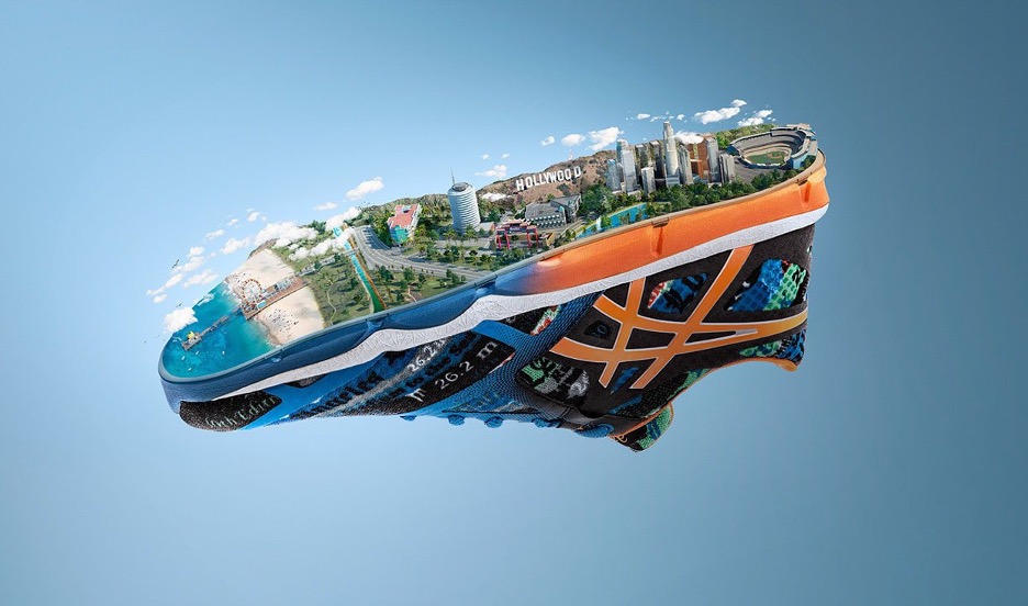
01. Allow location to be part of your design inspiration
ASICS worked with VITRO on their sponsorship of the 2015 Los Angeles Marathon, which included a beautifully produced image of key L.A. landmarks by Stuart Rowbottom and Mike Campau. Dodger’s Stadium, the Downtown LA skyline, the HOLLYWOOD sign, the Capitol Records building, Chinatown, The Beverly Hills Hotel, and the Santa Monica Pier were all represented on the bottom of an ASICS shoe.
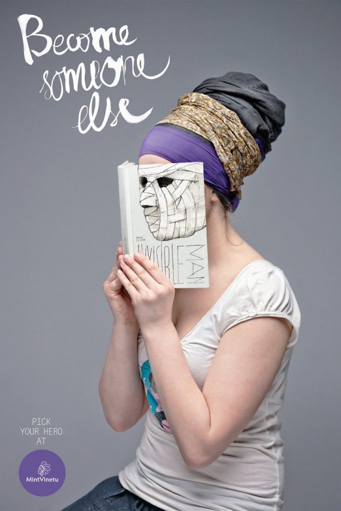
02. Juxtapose imagery to trick the eye
Love Agency’s striking “Become Someone Else” campaign for Lithuania’s Mint Vinetu Bookstore blends the faces of the readers with nearly sinister book covers.
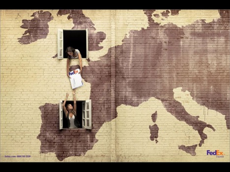
03. Show don’t tell
DDB Brazil created this simple but effective campaign for FedEx, using continental maps on buildings to get their message, and their package, across.
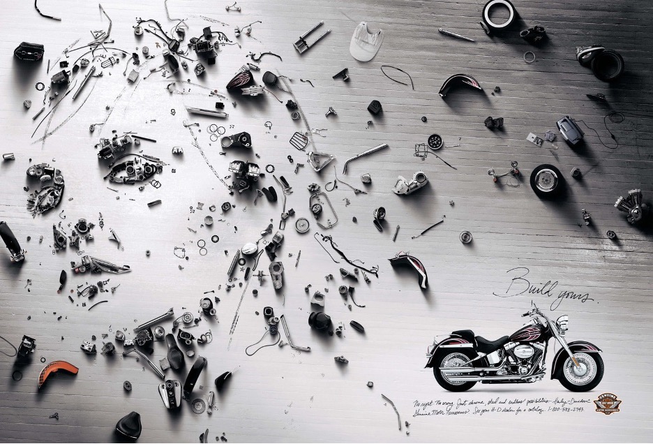
04. Consider the individual parts that make up your product
The Cannes Lion winning print campaign for Harley Davidson Parts and Accessories featured portraits of bike owners created by pieces of dismantled motorcycles. The concept was created by Brock Davis and Eric Sorensen.
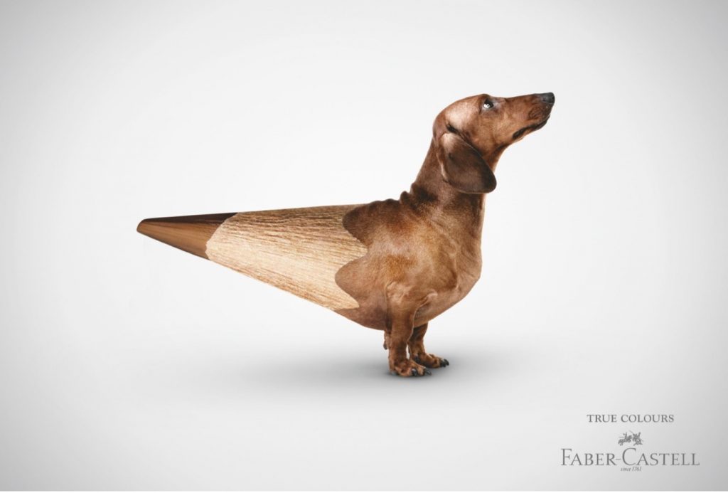
05. Think of creative ways to showcase one aspect of your product, like color
Serviceplan’s campaign for Faber-Castell color matched their product (colored pencils) with real-life animals and objects.
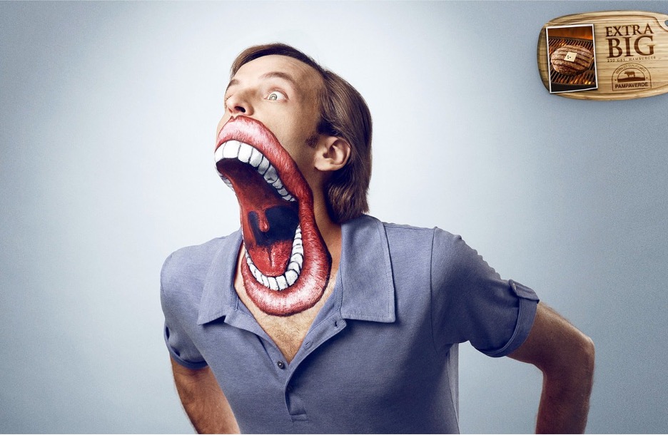
06. Play with proportion
This ad definitely got my attention and frankly, kind of scared me. Playing with proportion won’t always be beautiful, but it can be eye-catching.
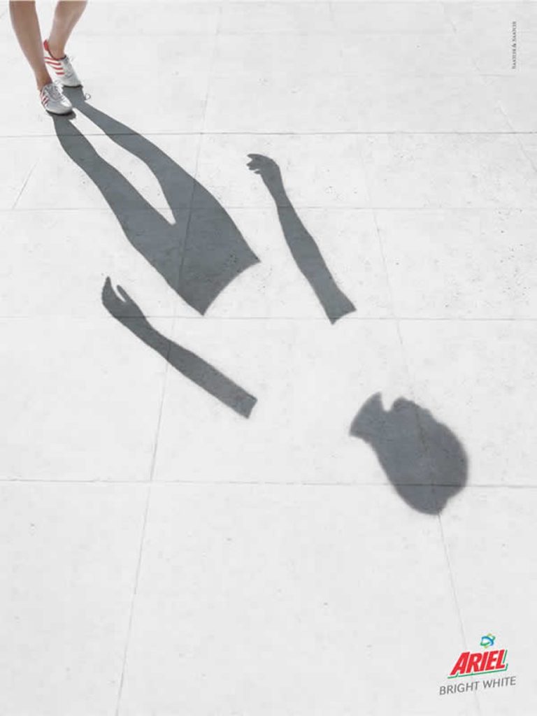
07. Exaggerate to communicate your message
Exaggeration can make for some interesting concepts. Ariel makes the person’s shirt so white in this advertisement by Saatchi & Saatchi that the shadow is blocked.
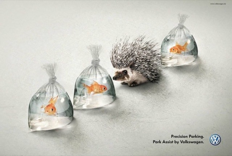
08. Show how you make your customer’s life easier
How does your product make your client’s life easier? Show it off in your ad, like Chief Creative Officer Eric Schoeffler did with his team at DDB Tribal Berlin when they created this advertisement to help Volkswagen increase their sales of optional features with their new cars, like the park assist. If it’s the type of product where you can inject some humor, even better.
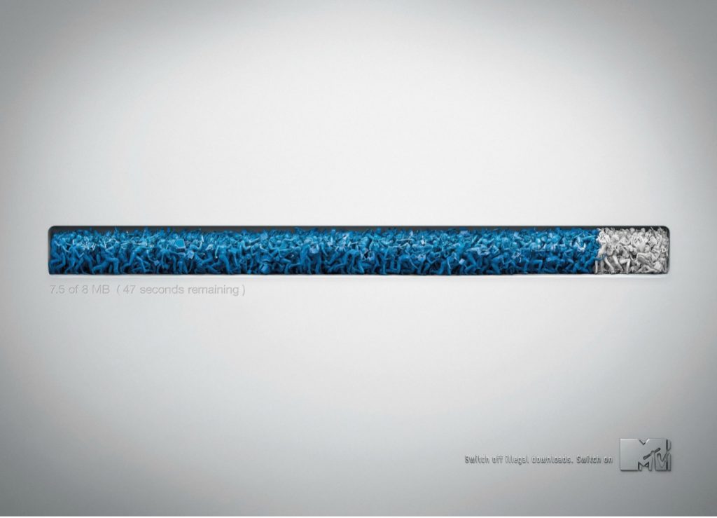
09. Get creative with the details.
The online download bar made from music fans and musicians is used in the “Switch off illegal downloads. Switch on MTV” campaign to show that fans actually harm their musical heroes when they steal their music. Getting creative with the details can liven up an image that in itself isn’t that interesting. Patrick Ackmann was the Creative Director on this cool project for MTV Europe.
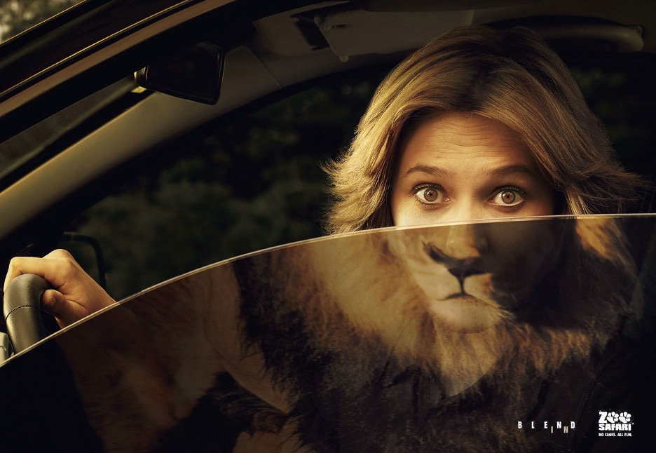
10. Play with the unexpected
Creative Directors Sergio Valente and Rodolfo Sampaio of DDB Brazil created a cool campaign for Zoo Safari with a clever take on the tagline, “Blend In.” Other human/animal image mashups in this series that might cause you to do a double-take include a man morphing into a gorilla and a man blending seamlessly with a tiger.
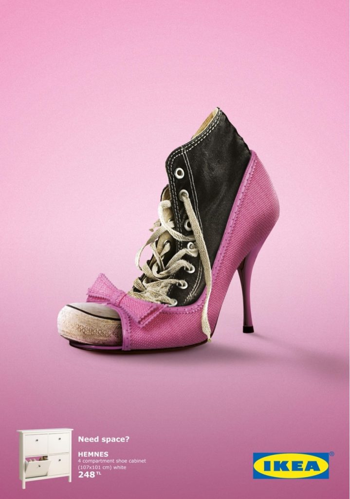
11. Highlight the problem
The team at TBWA/ISTANBUL created this bright print advertisement for IKEA to highlight the lack of closet space in order to sell their space-saving solutions.
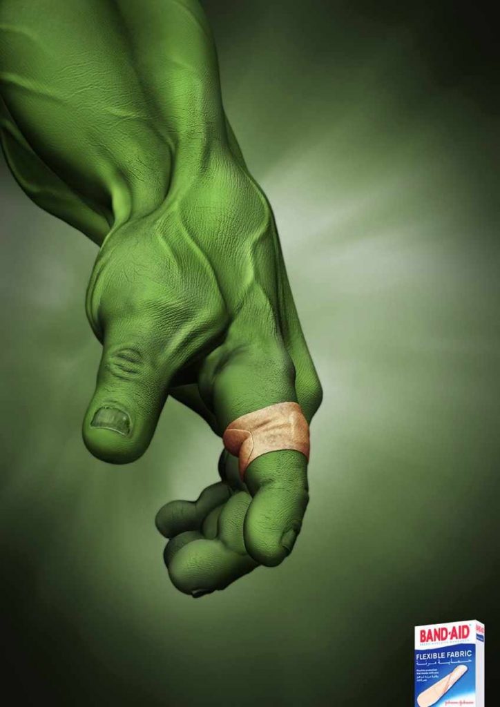
12. Turn to pop culture
Who needs a flexible Band-Aid more than Bruce Banner? J. Walter Thompson Dubai created this eye-catching advertisement featuring one of our favorite Marvel superheroes, The Hulk, and made the emphasis on a functional aspect of the product way less boring.
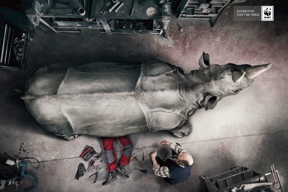
13. Choose an unexpected visual perspective
BBDO Spain placed extinct animals in an auto mechanic garage setting to get the World Wildlife Fund’s message across – “Extinction can’t be fixed.” The aerial view adds a unique perspective.
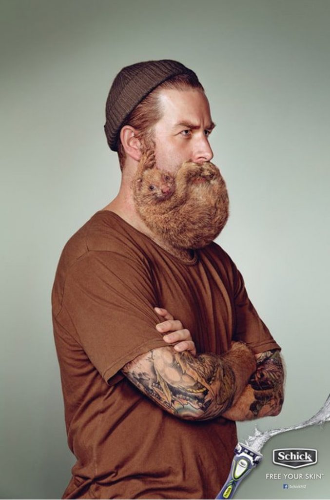
14. Shoot or edit photographs to produce clever effects
Chief Creative Officer Josh Moore of Y&R in Auckland, New Zealand and his team orchestrated this campaign for Schick that used cute, furry living creatures in place of beards.
15. Embody your marketing personas
Do you know your/your client’s ideal marketing personas? Bring one to life like Creative Director David Oldfield did for LifeProof.

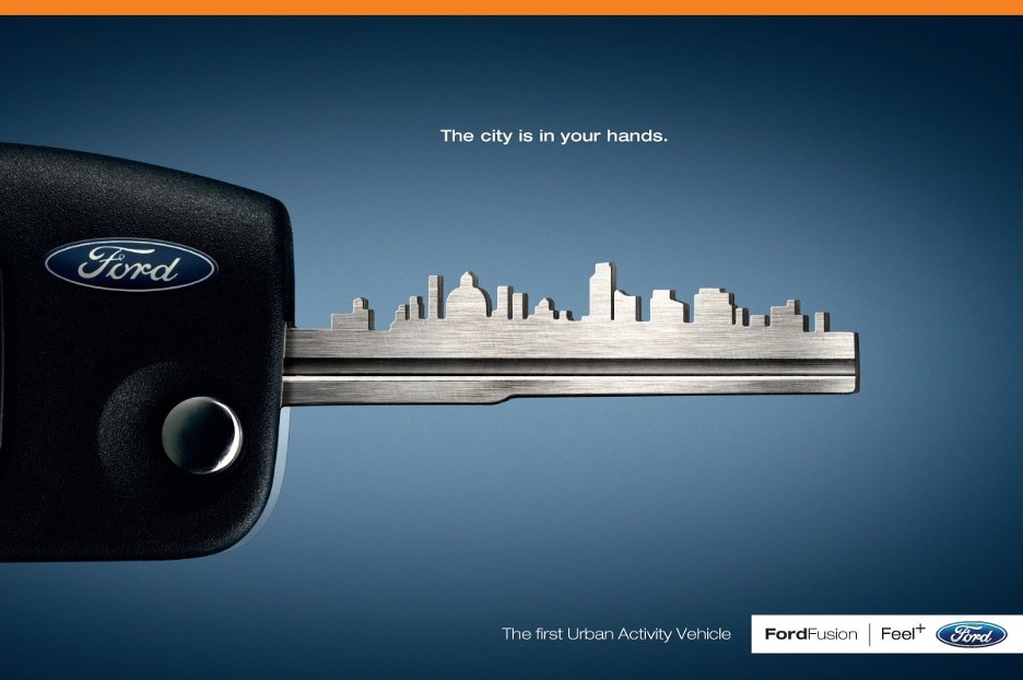
16. Show your customers that you get them
Think about your target audience – where do they live? What do they do? The key skyline in Ogilvy’s ad for the Ford Fusion positioned the automobile as one for city-dwelling explorers.
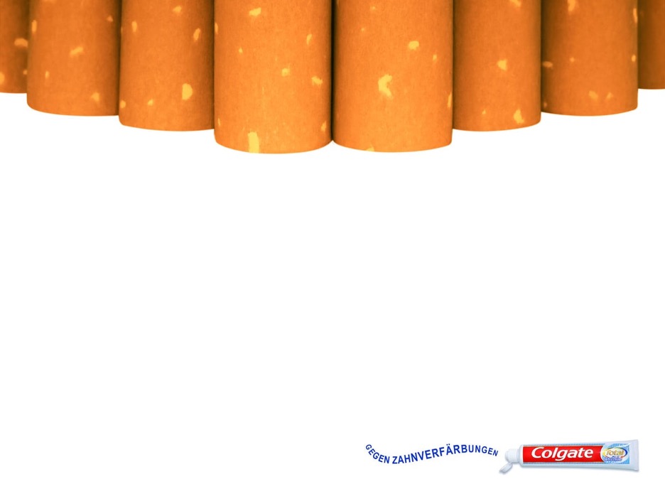
17. Attack the enemy
Rather than showing how white Colgate can make their teeth, Young & Rubicam featured the problem itself rather than the solution. Replacing teeth with their enemies, including teeth-staining substances like cigarettes, coffee beans, and tea bags, grabs your attention in an entirely different way.
18. Use white space
This advertising school project from Zink Project in Madrid, Spain used eye-catching color to fill in lots of “white” space. Relying on a blanket of color for more than 75% of the ad’s size gets these Volkswagen Sharan advertisements noticed.

19. Play with scale
The goal of this project by California State University – Long Beach was to convey the utility and convenience of owning a Mini Cooper. They overdramatized the story of being small and fitting into any environment to create a magical world where the cars co-existed with ladybugs.
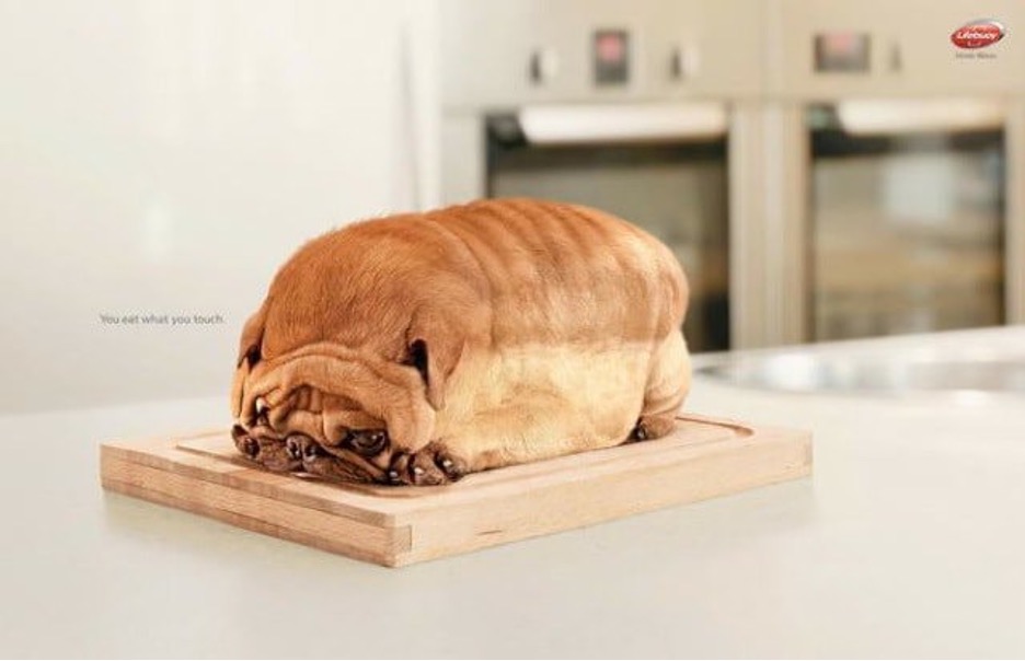
20. Mix up the context
Cats shaped like cupcakes? Dogs in the form of a loaf of bread? Lowe agency in Jakarta used humor and eek factor for the Lifebuoy Hand Wash campaign, “You eat what you touch.”
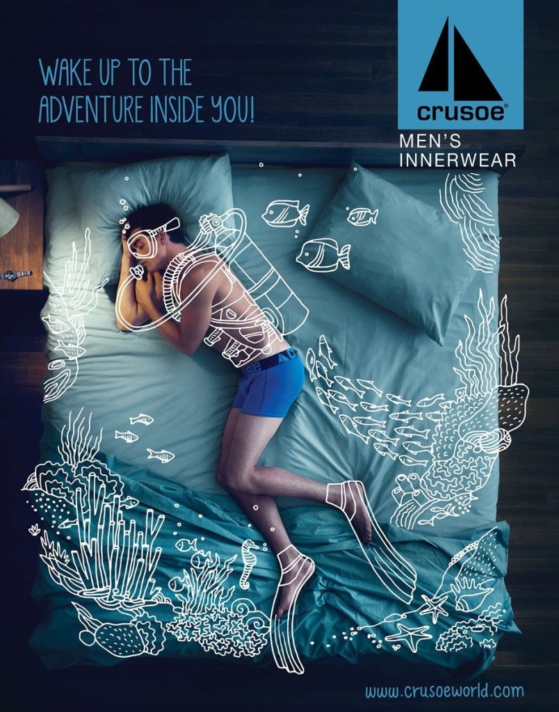
21. Incorporate interesting illustration
Black Swan Life’s 2014 campaign for Crusoe Men’s Innerwear layered lifestyle element illustrations over photographs of sleeping men.
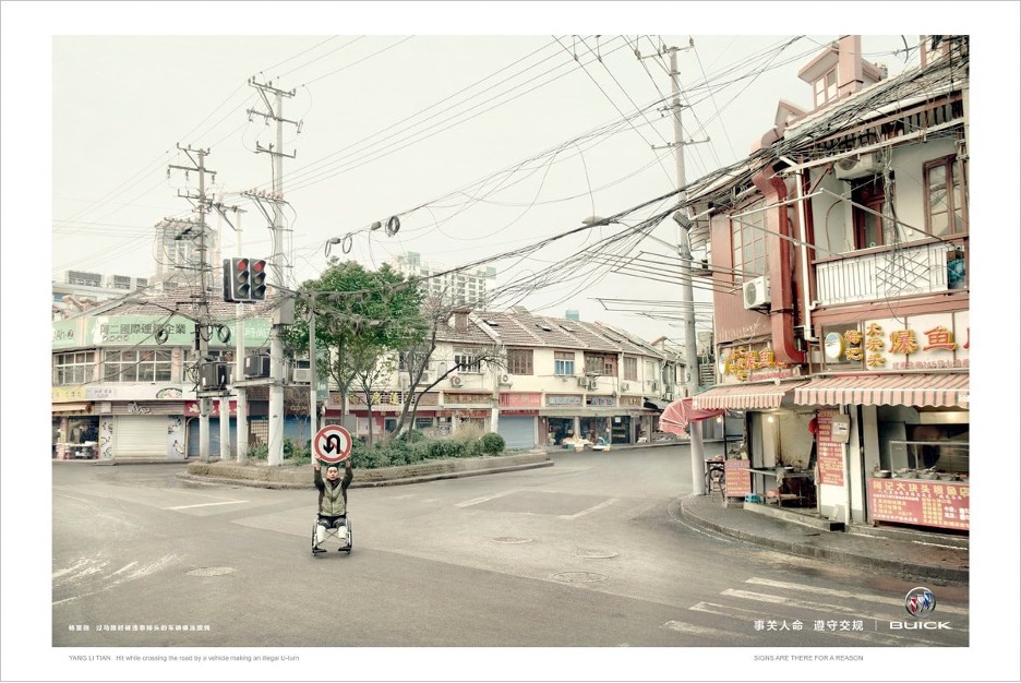
22. Appeal to consumers’ emotions
Lowe China created this Gold Lion Award winning campaign for Shanghai General Motors/Buick featuring real people who’d been injured by careless drivers standing in the street holding up the exact signs that drivers ignored. The tagline for this safety campaign was, “Signs are there for a reason.”
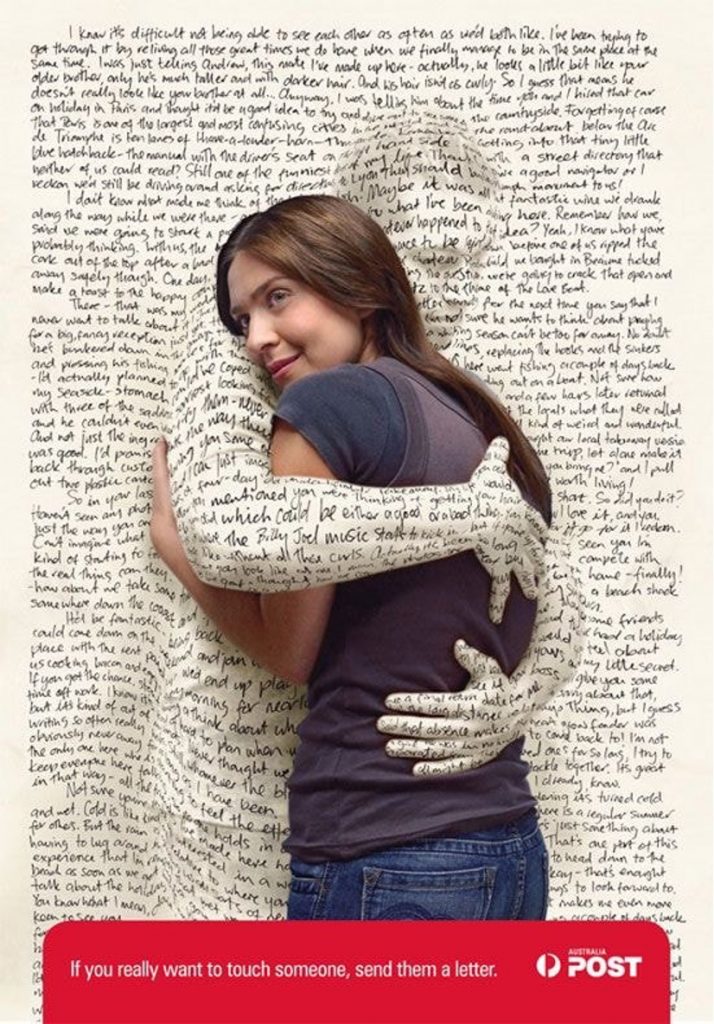
23. Humanize an object
This eye-catching print advertisement from M&C Saatchi, Melbourne for Australia Post reminded people how it feels to receive a letter from a loved one.
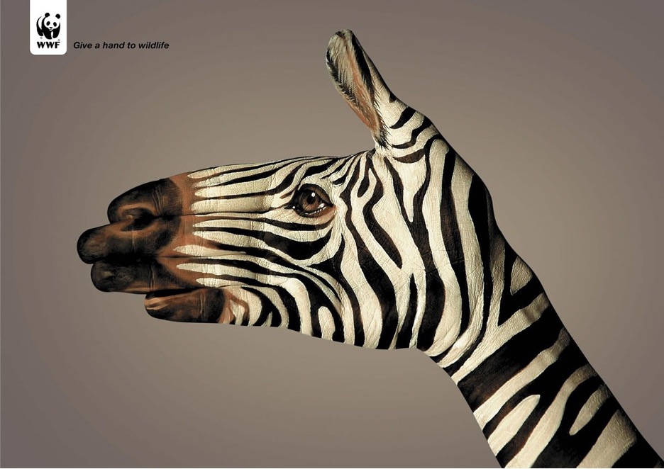
24. Be creatively literal
The “Give A Hand to Wildlife” campaign for the World Wildlife Federation has striking, pointed imagery, painted on an actual hand.
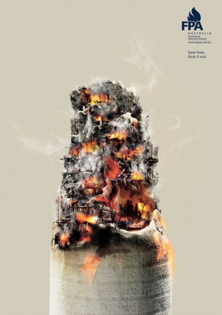
25. Alter photographs to create meaning with the details
Executive Creative Director Julian Watt and his team developed a nicely detailed public awareness campaign for the Fire Protection Association of Australia.
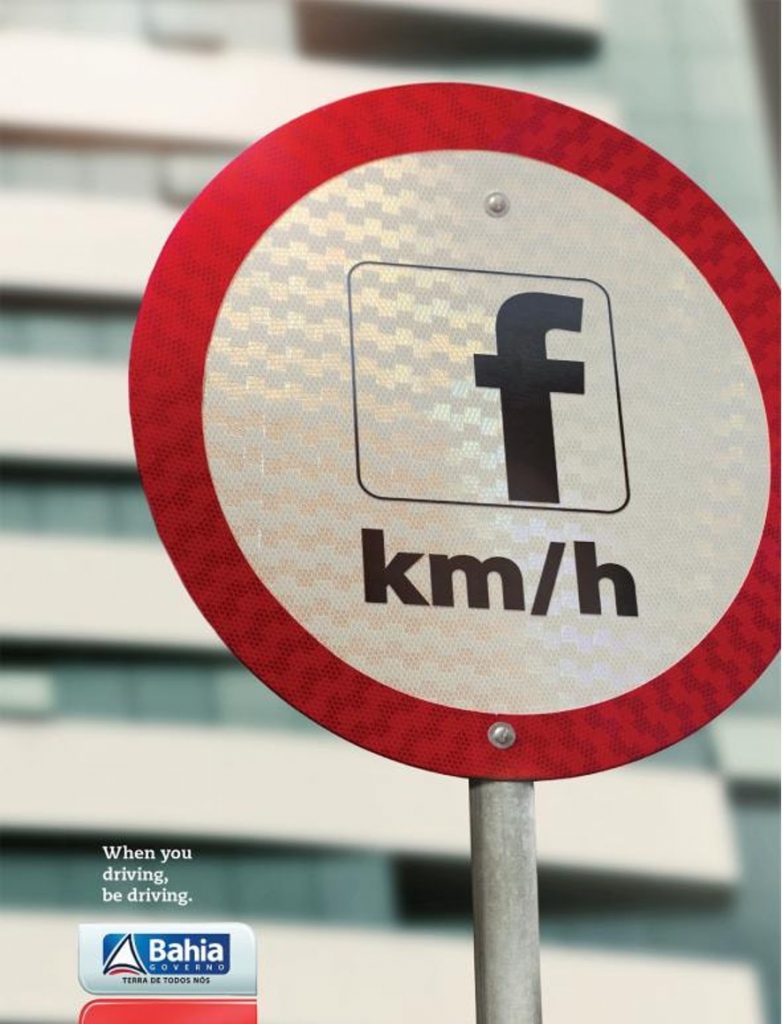
26. Grab their eye with recognizable icons
The Government of Bahia worked with Brazilian ad agency Leiaute Propaganda to curb the number of accidents and deaths related to smartphone use. Each ad uses a social media network symbol in place of important driving signs.
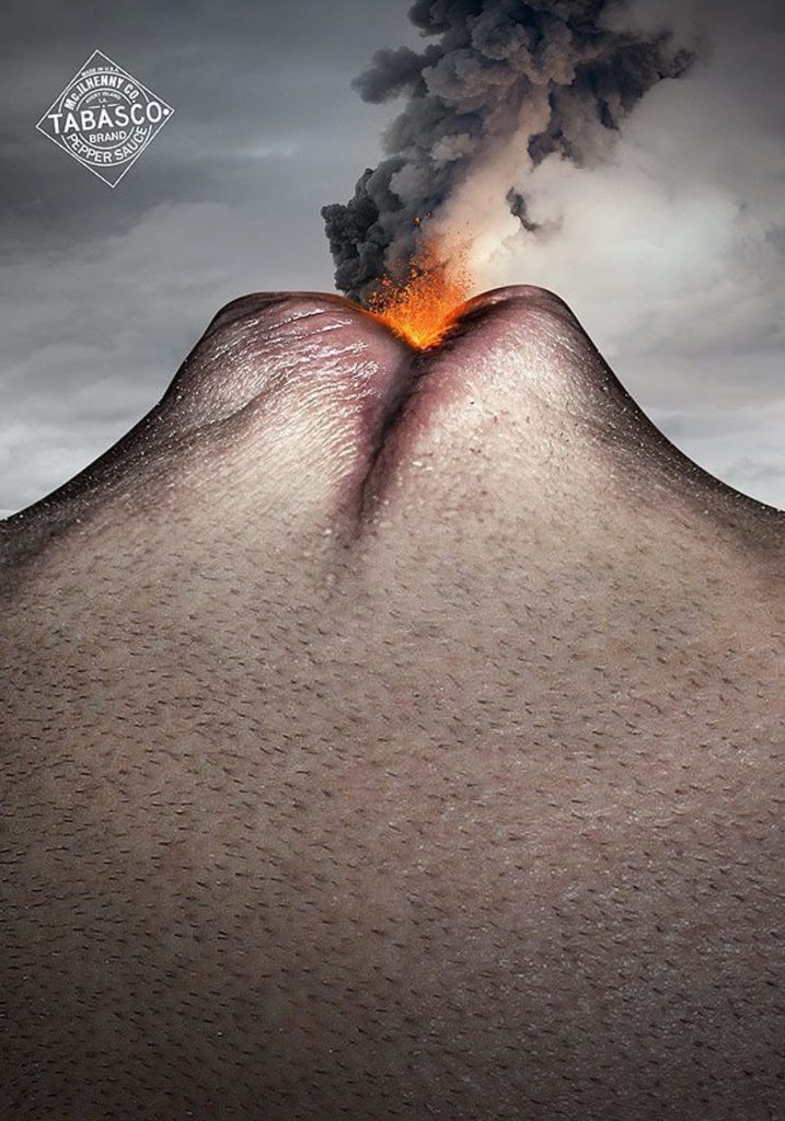
27. Rely on a single strong visual to communicate the key concept
Nicolas Baillargeon was tasked to create images that communicate the key essence of hot and spicy Tabasco sauce—the spicy heat itself. This bold image of a volcano crafted from a human face does the trick for me.
28. Use the product to create the image
Another nice use of minimalism, this time with pasta. Spaghetti in the shape of a fireworks display is a perfect way for pasta maker Barilla to ring in the new year.

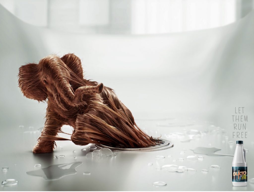
29. Incorporate an element of fantasy
Farenheit DDB Peru took home 2 Bronze Lions for the “Let Them Run Free” campaign for Dukto Drain Opener. The concept combined what the product does with the images of hair-trapped animals.
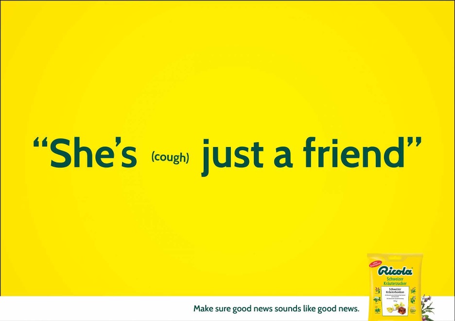
30. Let the copy take the lead
Miami Ad School Europe used humorous copy written by Daniel Blomberg for these brightly colored Ricola print ads that reminds us to, “Make sure good news sounds like good news.”
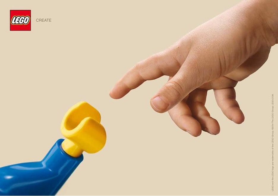
31. Let famous artwork inspire your concept
Jung von Matt Hamburg developed the “Create” campaign for Lego that was inspired by Michelangelo’s The Creation of Adam.
32. Go minimal
Adolfo Murillos’s minimalistic campaign for Bayer Asprin gets the message across simply and beautifully.
33. Consider where your ad will be shown
Ogilvy Malaysia’s outdoor advertising for Lego doesn’t just work with the environment it is placed in, it uses it as part of the campaign itself.
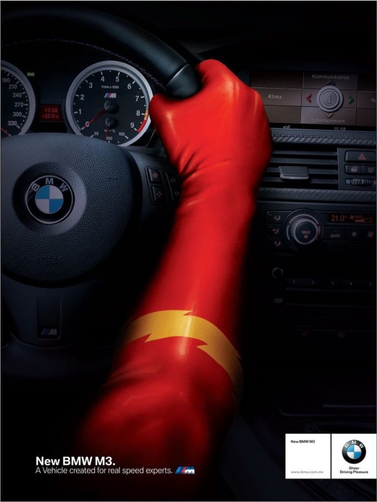
34. Recruit a superhero
Creative Director Marco Gpe developed this tongue-in-cheek concept for BMW hinting that DC Comics superhero The Flash knows a thing or two about speed.
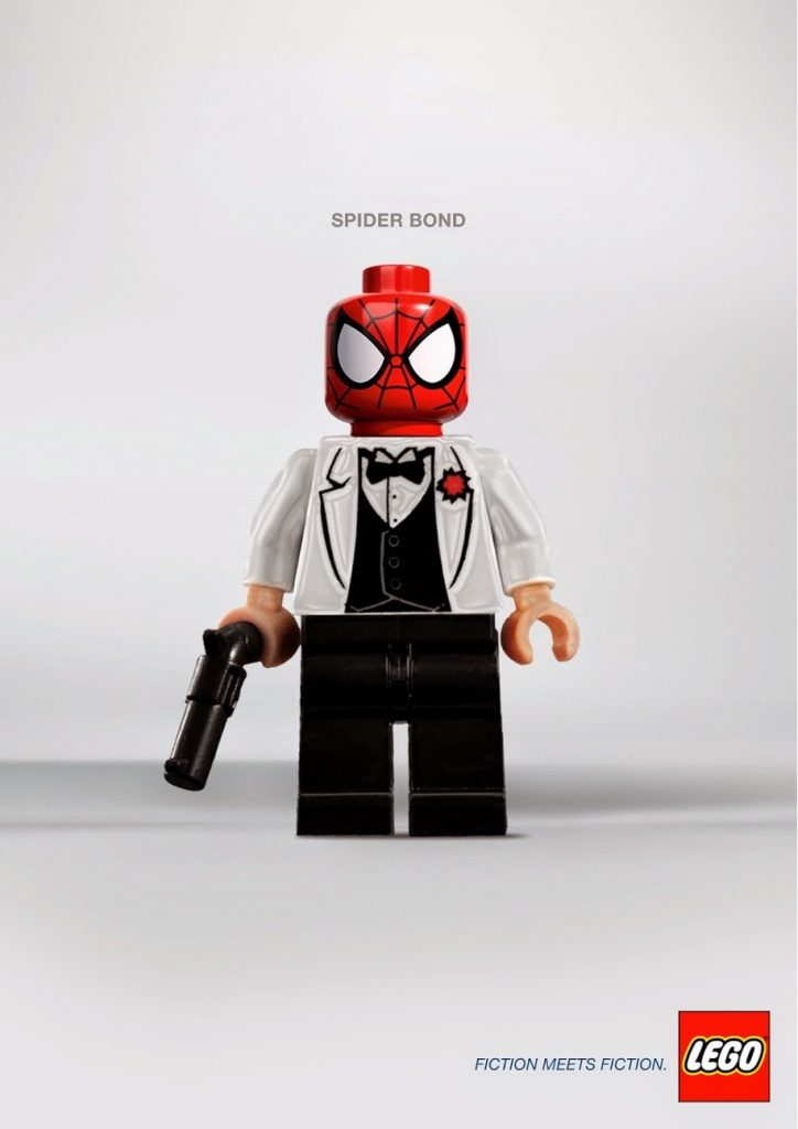
35. Mashup well-known icons
Spider Bond, Homerine, and Iron Bat are part of the fun, clever Fiction Meets Fiction concept series of Lego character mashups by Alexandre Tissier. Although Lego didn’t commission this fresh work, I think they should use it!
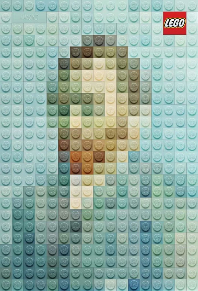
36. Use your product to build something instantly recognizable
Creative Director Kenny Blumenschein and Art Director Marco Sodano of Geometry Global in Hong Kong recreated artistic masterpiece paintings using their client’s product – Legos.
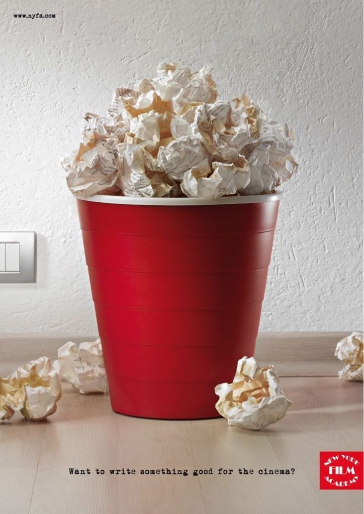
37. Use a visual metaphor
When Red Cell Milan created the advertisement to attract new screenwriting students to the New York Film Academy they built “popcorn” from a garbage can full of trashed drafts, something all would-be-screenwriters can relate to.
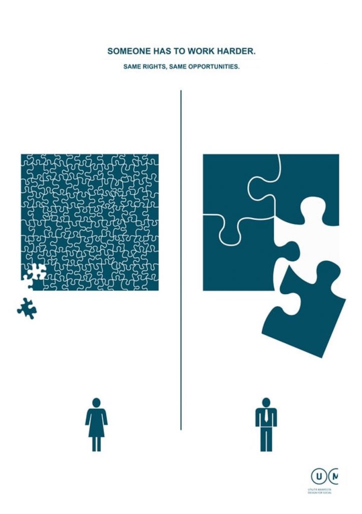
38. Use simple design concepts to illustrate big differences
This series of posters from Manifest Utilità creates symbolic simple images with clean line design to represent gender equality.
39. Show (and tell) how the product makes the problem go away
Combining cleverly worded copy and imagery in this advertisement created for STIHL shows and tells how their blowers and shredder vacs literally make the bad news go away.
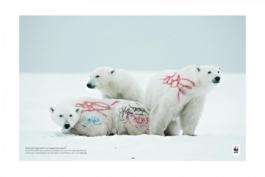
40. Make a bold statement
“Respect the Planet” is another fantastic statement ad series for the World Wildlife Fund. Chris Garbutt of Ogilvy & Mather Paris was the Executive Creative Director on this campaign that uses animals tagged with graffiti to get the point across.
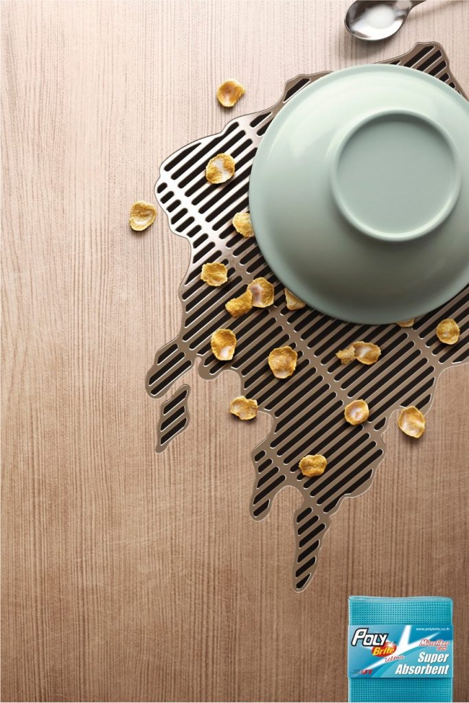
41. Supersize the strength of your product in concept design brainstorming sessions
The super absorbent strength of Poly-Brite is like having your own portable drain for spills. This product concept by Ogilvy & Mather, Bangkok offers a refreshing point-of-view for a product category that’s been around for a while.
42. Use opposing images (and ideas) to deliver a big message
This poster design for the Anti-Racism Festival 2010 was commissioned by the Greek Graphic Designers Association (GGDA) and designed by Unusual. They amped up their social commentary by producing an image that depicts handshakes and handguns.
43. Meet your clients where they work
When Vodafone hired Y&R, İstanbul/Team Red, Turkey to publicize the specialized services that they’re providing for farmers, they used their imagery to speak to place.

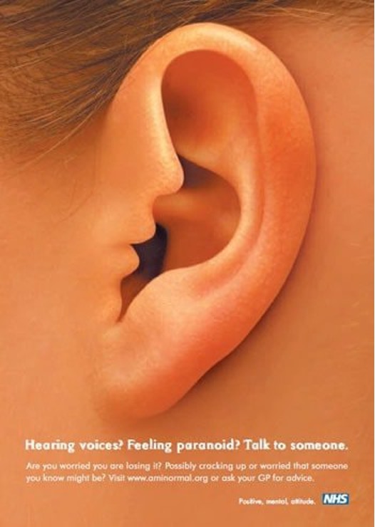
44. Put your concept in motion
The interactive version of this NHS poster campaign uses audio and visuals to show the voice “whispering” into the woman’s ear.
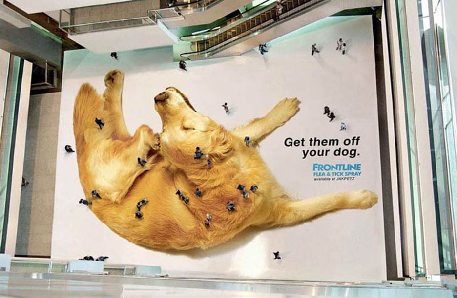
45. Let your environment provide the “wow” visuals
Perwanal Saatchi & Saatchi’s ad for Jakarta, Indonesia’s pet emporium JAKPETZ promotes Frontline Flea & Tick Spray with a huge floor sticker ad in a shopping center. When viewed from higher levels, it looks like people are the “fleas” appearing on and off the dog
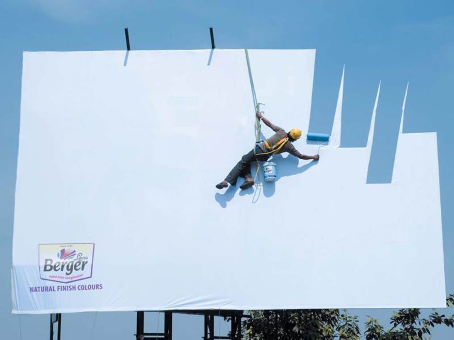
46. Use optical illusions
This billboard advertisement by JWT Mumbai for Berger seemingly blends the company’s paint into the sky…provided it’s a clear sunny day.
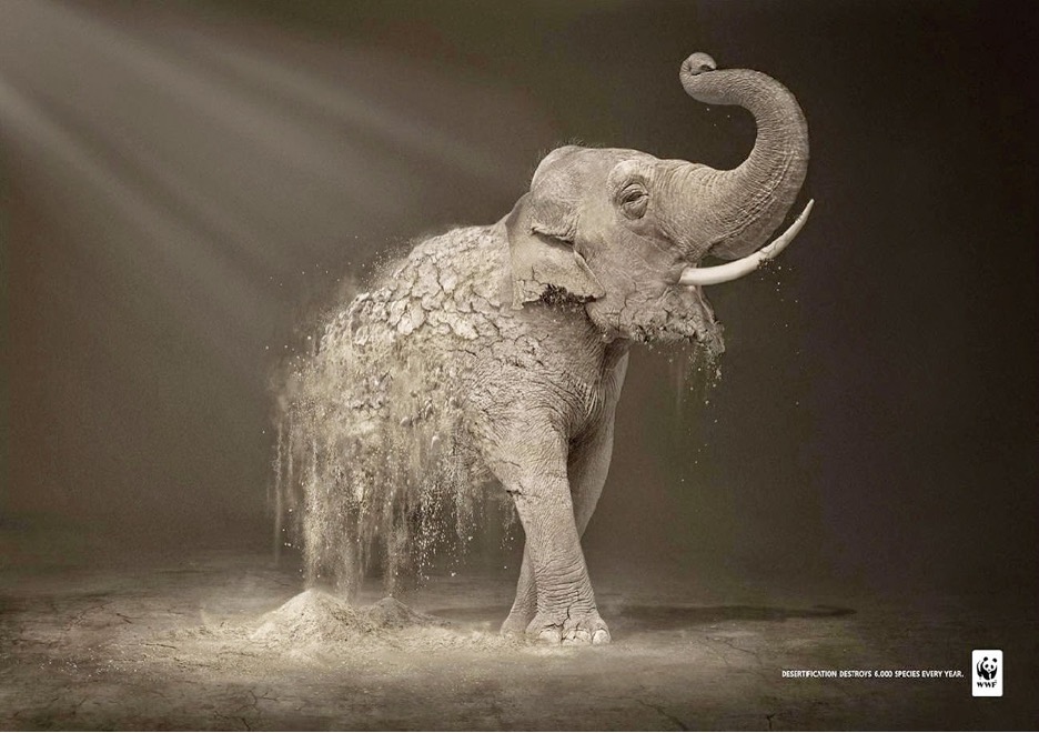
47. Think about the emotional impact of your visuals
More incredible World Wildlife Fund imagery – “Desertification” depicts amazing animals turning to dust, putting the emotional “what happens when they’re all gone” message right in your face.
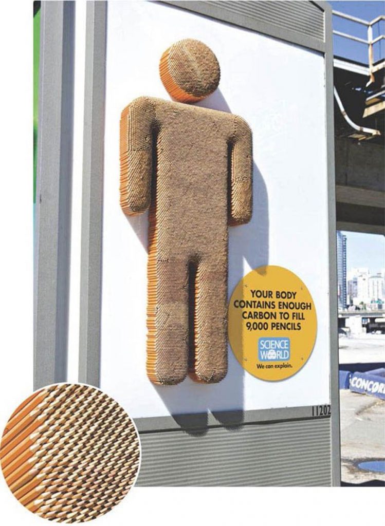
48. Consider your medium
No one says your outdoor advertising can’t be three-dimensional. This fantastic ad for Science World hooks the audience by visualizing the ad copy in 3-D format.
49. Use bold emotional symbolism
This anti-racism poster for the Swiss Chapter of S.O.S. Racisme employs strong emotional symbolism to communicate the message.

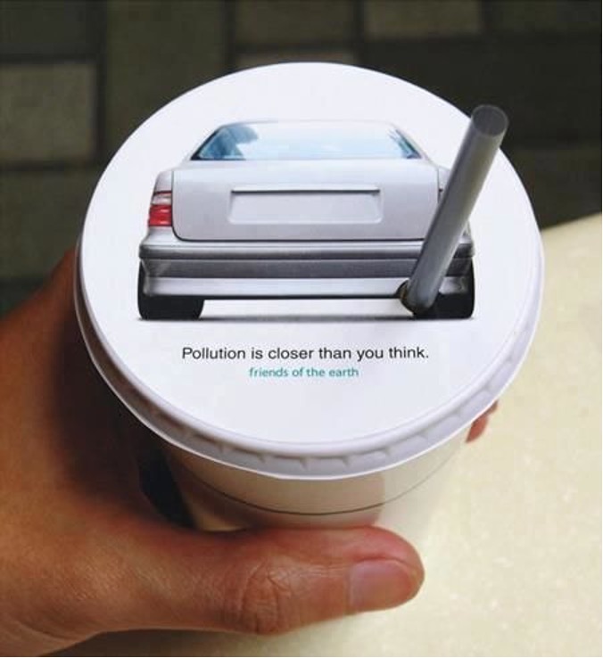
50. Think about the “where.”
JWT Hong Kong created this air pollution awareness campaign on the top of drink lids used by roadside food carts to get customers thinking while they’re immersed in the problem.
51. Toy with the macabre for a dramatic effect
Creepy can work with the right audience.
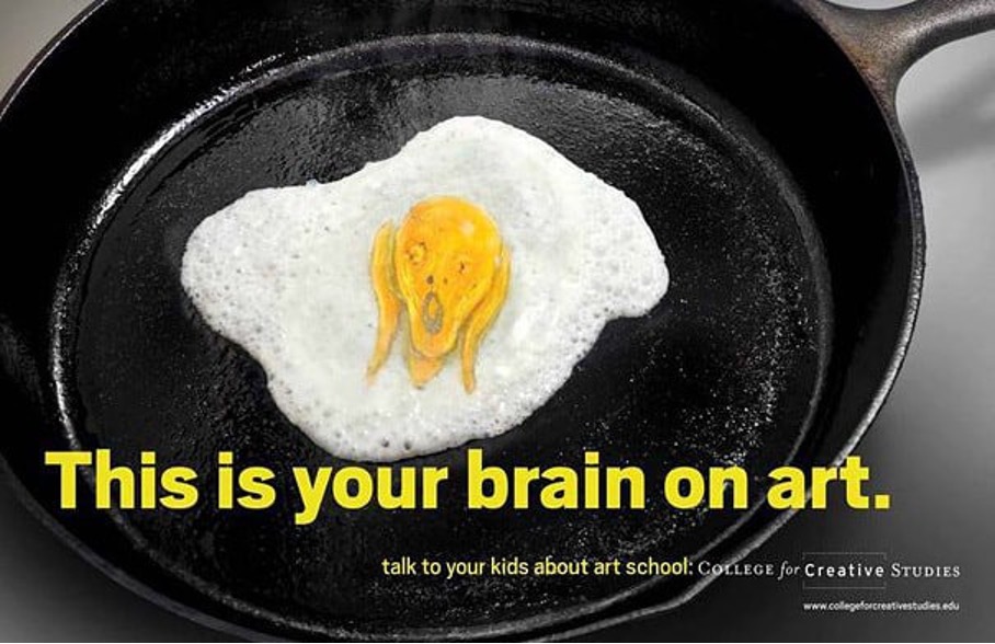
52. Create a humorous riff on a classic ad
I’m old enough to remember the “fried egg” 80s PSAs depicting what happens to our brains when we take drugs. This ad campaign for the College for Creative Studies mocks the originals in a clever, humorous way using a great combination of copy and visuals. The Edvard Munch egg yolk adds a funny, thematically relatable visual element.
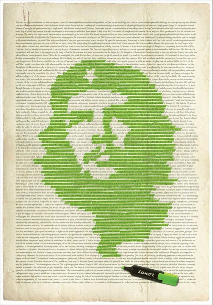
53. Use the product in an unexpected way to attract your target audience
We aren’t really supposed to use highlighters to create portraits of Che Guevara, but it’s a great way to market highlighters to idealist college freshmen.
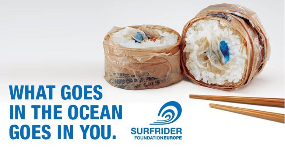
54. Show the average person how it really impacts their life
Designing a generic “save the environment” message might work for die-hard environmentalists, but to really get attention show your average joe what their garbage does to their sushi. Great campaign for Pollinate.
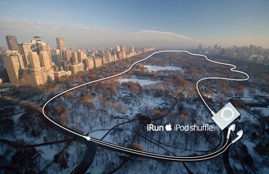
55. Show a typical use for the product in a creative way
iRun by Steve Quint showed the Apple iPod Shuffle in a unique way by using the earbuds to depict a running path through Central Park.
56. Consider typography that moves
If your medium allows it, try adding movement to your design. See the SoHo NYC billboard in motion by Sagmeister & Walsh.
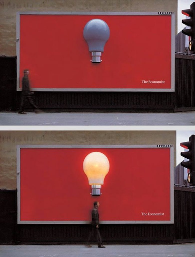
57. Make it truly interactive
This outdoor advertisement for The Economist was created to sense when a person was close to the sign and allowing their motion to turn on a giant lightbulb.
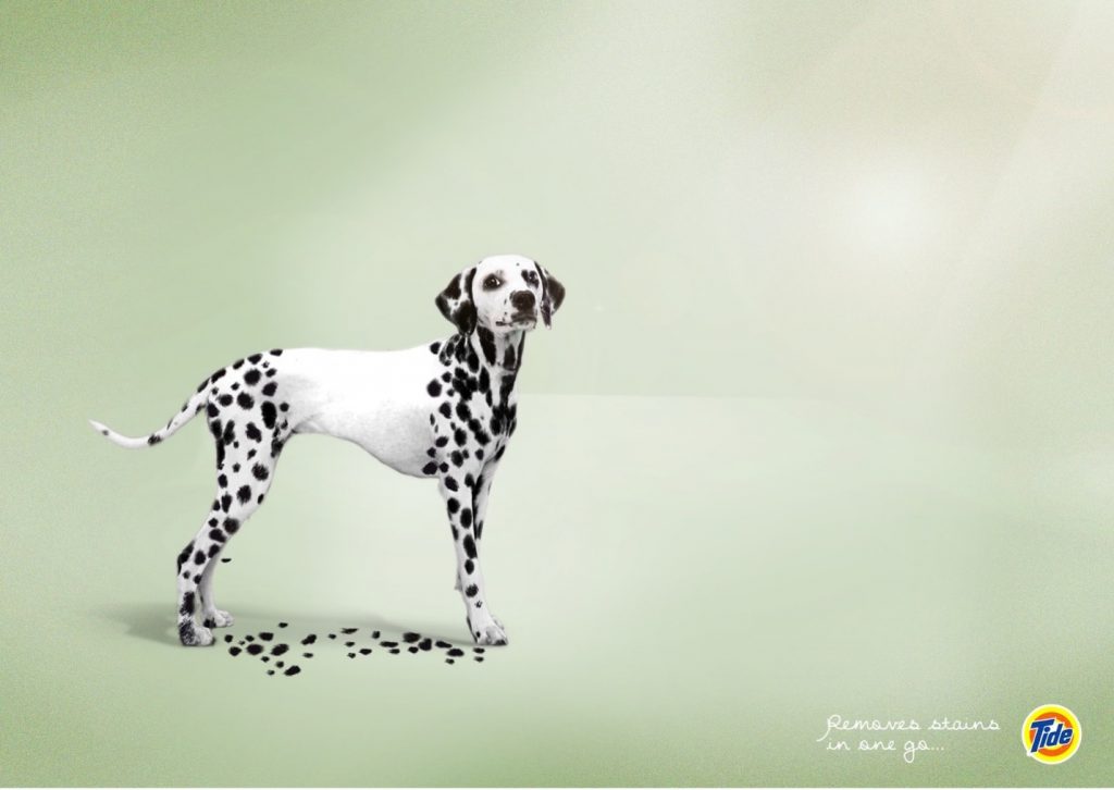
58. Play with white space
This engaging campaign for Tide takes being a solution to stain removal to a whole new level.
59. Go minimal
Sometimes it makes the most impact to let the product speak for itself in very simple, yet visually striking, ways.
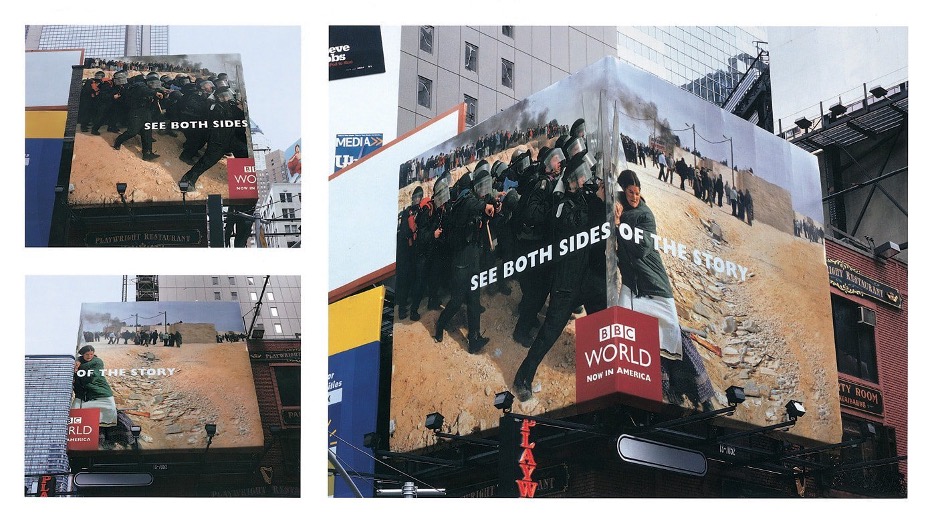
60. Take up space
BBDO New York created this clever take on the “See Both Sides of the Story” campaign for BBC by designing an advertisement that wraps around a street corner.
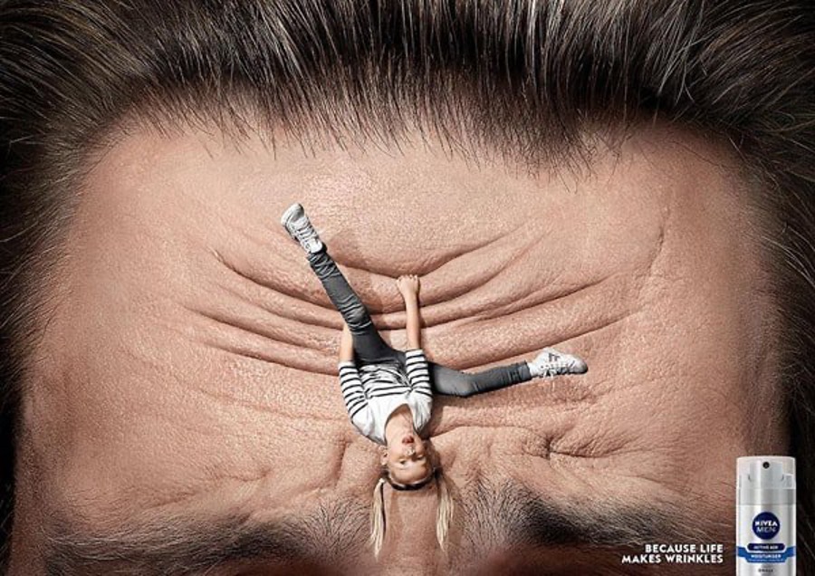
61. Externalize the problem
This ad for Nivea Men uses a great visual to show how the emotional moments of life can take its toll on your skin.
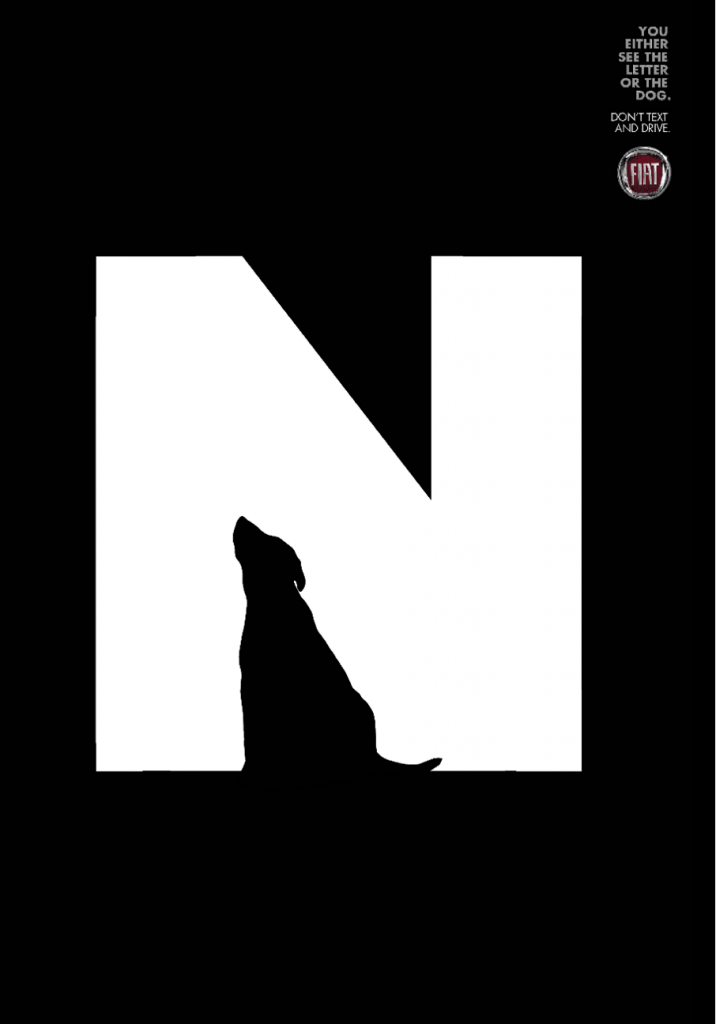
62. Negative space can be extremely powerful
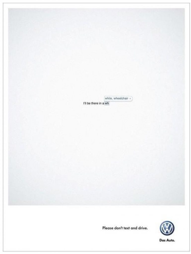
You don’t need a multicolored palette to create a great ad. Leo Burnett Tailor Made Brazil created an impactful “Don’t text and drive” campaign with negative space.
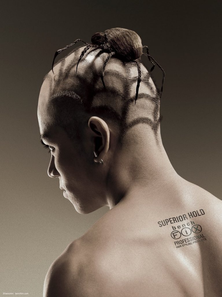
63. Be extreme
This campaign for Bench Fix Hairstyling Products reaches a younger demographic with atypical imagery.
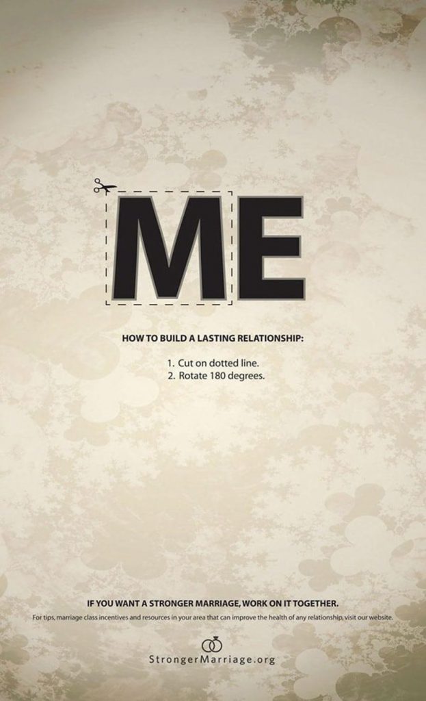
64. Let the copy be part of the design
This print advertisement for StrongerMarriage.org uses the cutaway type design element as part of its message.
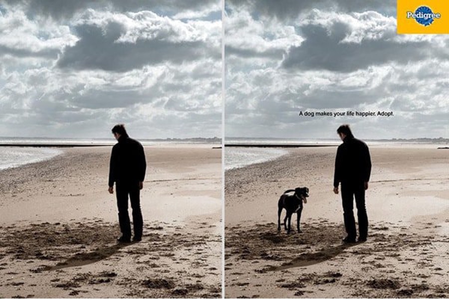
65. Take away the pain
Although I think that this Pedigree dog adoption ad could have been better (e.g., offer another pose of the downtrodden lonely man to make him more exuberant), the concept is nice way to show how adopting a dog actively changes a person’s emotional state and a good way to make an emotional connection with the target audience.
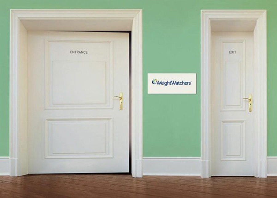
66. Use scale to make a strong impact
The unexpected difference of scale on the doors for this Weight Watchers ad captures attention.
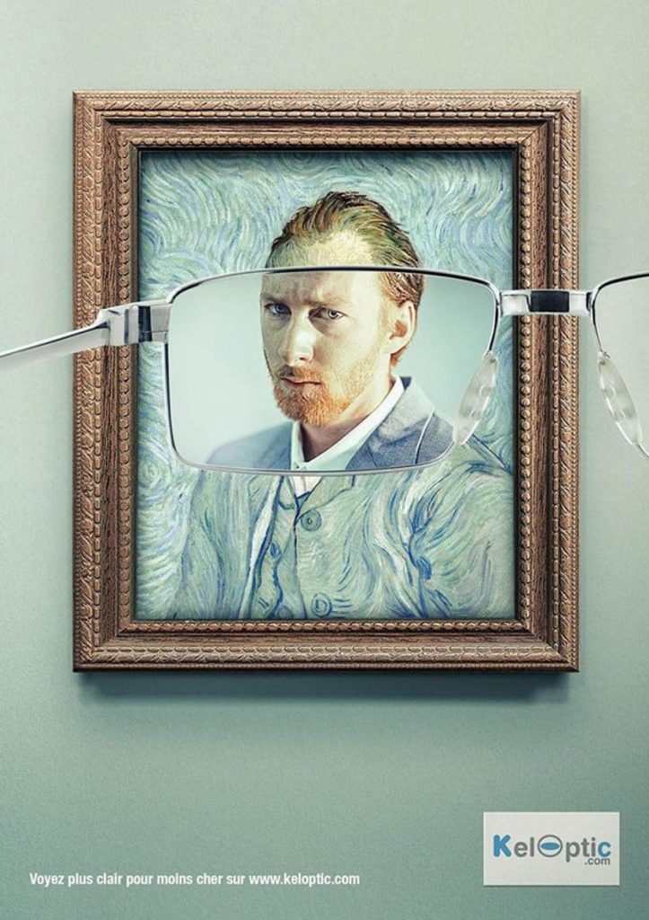
67. Tell tall tales
This series of advertisements for Keloptic illustrates a great use of exaggeration to get the purpose of the product across.
68. Use bright, clean design
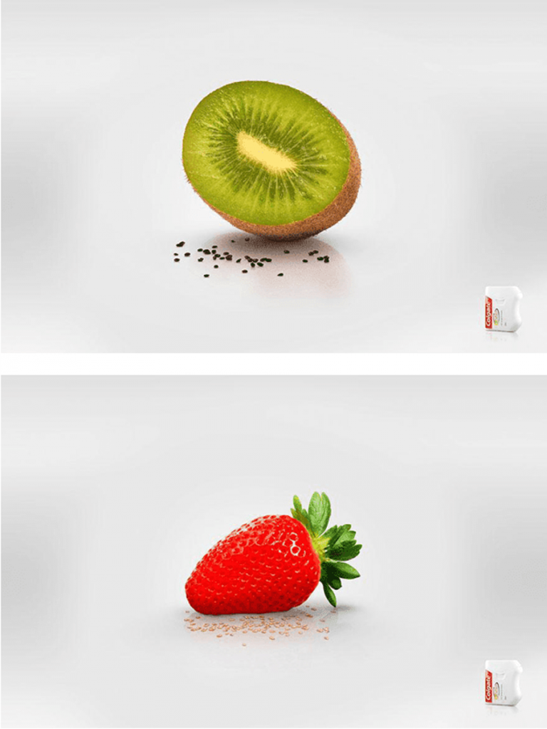
Great use of minimalism in this series of advertisements for Colgate dental floss that easily communicates the message.
69. Use unexpected elements as typography
Personally, this is not my kind of ad, but you can’t debate the ingenuity of using the decreasing size of the human body as part of the copy-based ad concept.
70. Employ the “ick” factor
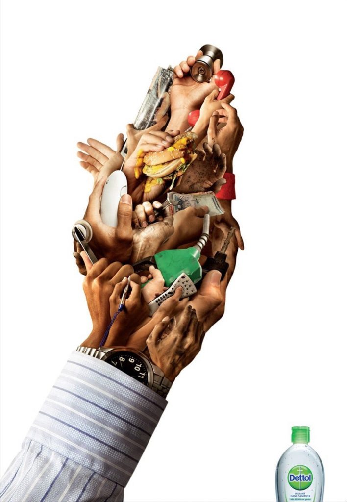
This advertisement for Dettol Instant Hand Sanitizer uses repellent visuals to capture the attention of germaphobes everywhere.
71. Minimalism can speak volumes
Another example of a great “don’t text and drive” campaign—this one is from Volkswagen and uses minimalism very well.
Whether you make a statement with bold colors, in-your-face concepts, or recruit actual superheroes themselves, it’s more important than ever that an advertising campaign stands out in a crowd. A 2007 article from CBS News suggested that Americans see up to 5,000 advertisements a day – and that was eight years ago. Investing time in recruiting the best team to create the right content for your brand is crucial, perhaps more than ever before
Image Source: Canva`